HireACamp is an online marketplace that lets travellers easily Search and book camps with local camp owners pan India. Their consumer facing website aims at allowing travellers to search, discover and instantly book from a wide range of campsites all suiting to their interest.
More accurately, in the words of the founder himself – “airbnb, but for camping”.
My role
During my time as a design intern at HireACamp, my job was to give the Hireacamp’s website a complete makeover and improve the overall website experience in all aspects, from rebranding the landing page, making the search user friendly, to reflecting the company through the “about us” page.
Redesigning
I took this internship, because I found the idea really exciting. Booking campsites online wasn’t something I had heard of before. Redesigning this experience meant I had to keep the essence of camping alive, while giving a new identity to the product.
Research & findings
Although I was given the freedom to completely erase the current design and go from scratch, I still wanted to learn from the current designs and see what exactly lacked.
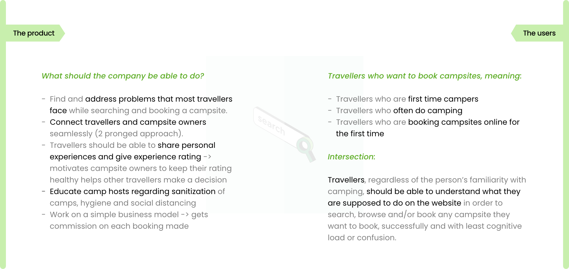
I started by understanding the product and users first. I listed down some pointers around how the different functions and flows work.
There are different types of travellers so will be their approaches of searching and browsing for campsites.
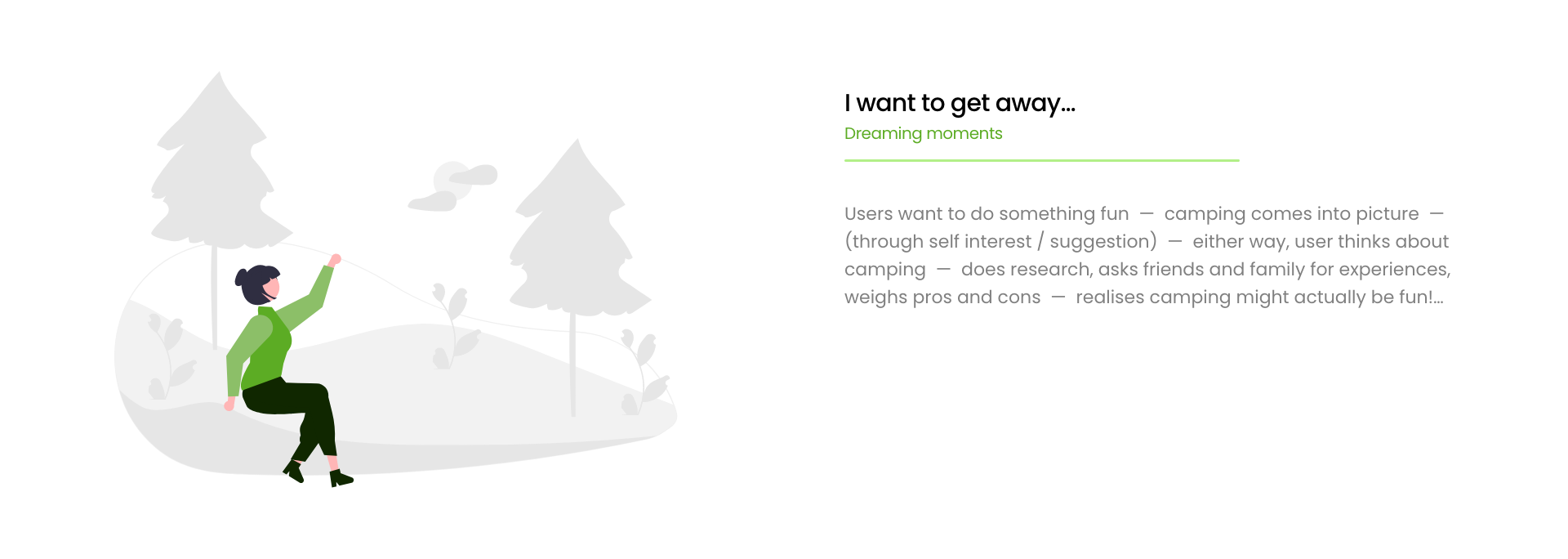
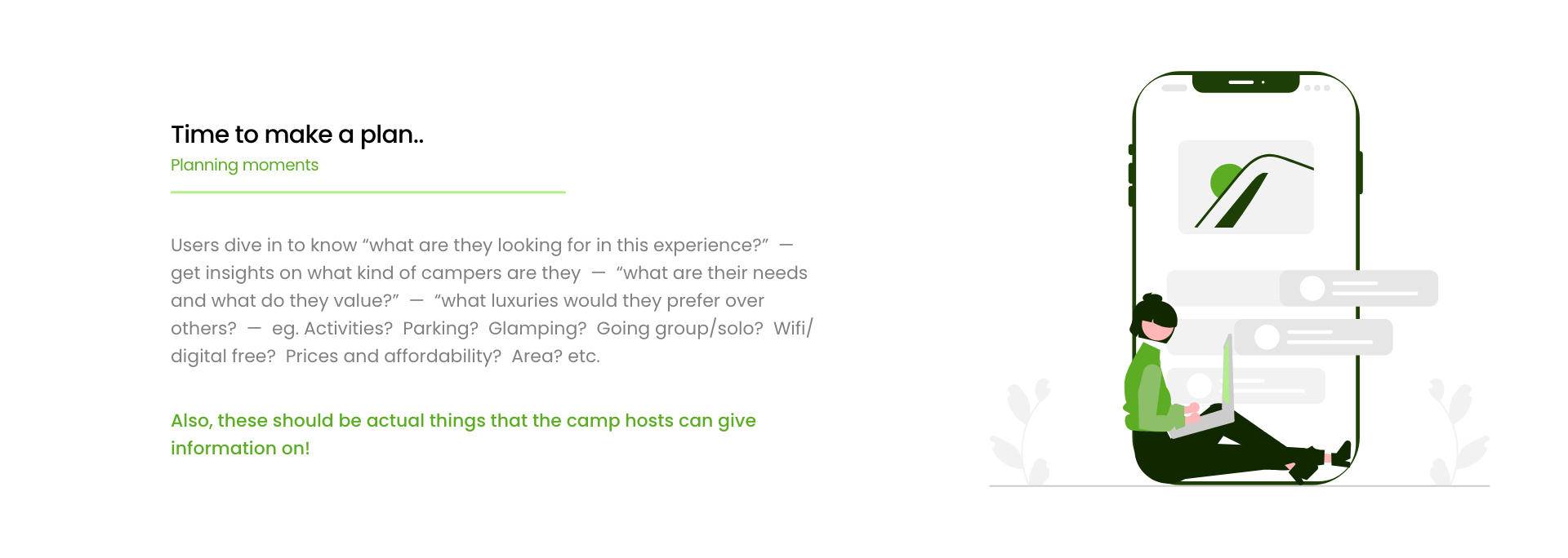
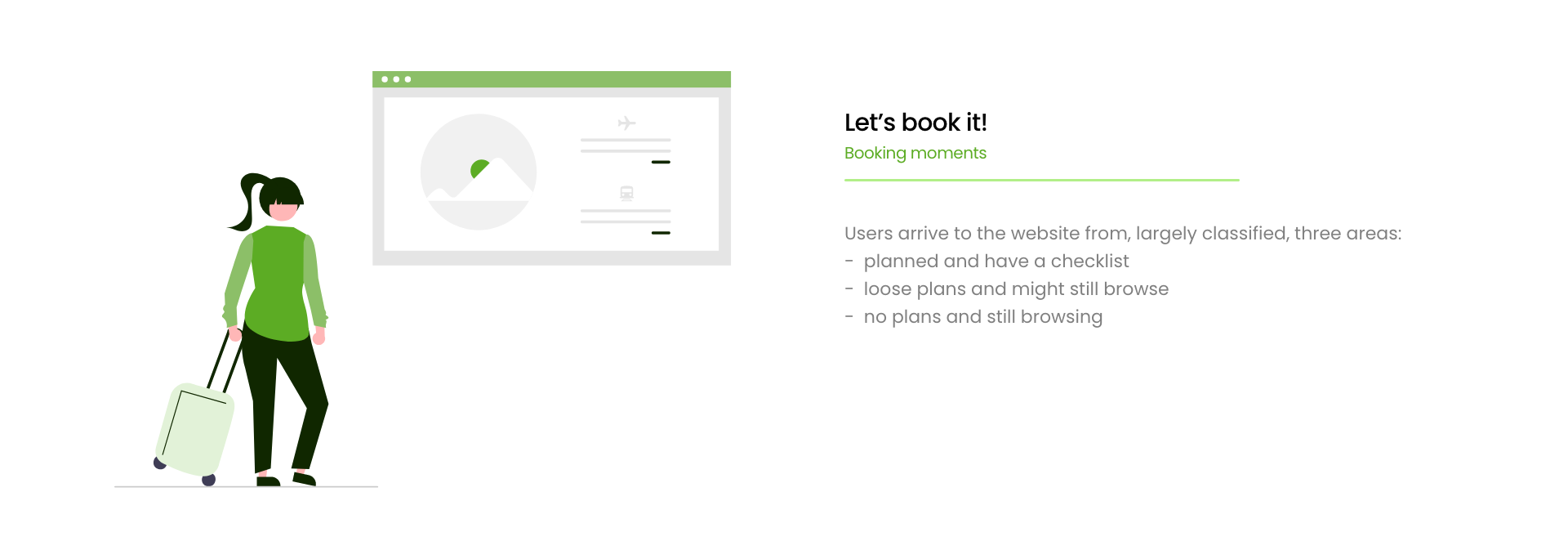
In order to understand the travellers and campers issues while booking, I took help from the best guide I could have for travel and navigation – “Google’s traveller’s moments”.
ANALYSIS
The main touchpoint or design opportunity in the journey came out to be when the user “searches” for a campsite.
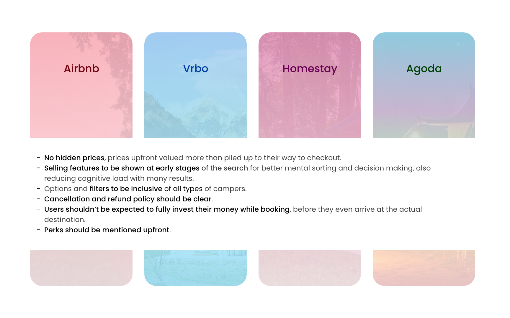
Competitors
I checked out some of the direct competitors in this domain. I tried to figure out how they have solved for their search experience, and gathered some pointers for help in ideation.
Defining the problem
I was told that – currently, the users are constantly calling to clear doubts not only regarding things that are not clear or conveyed to them on the website, but also questions on some actual unforeseen circumstances that were unexpected, irrational and not solved for.
These follow up calls were not only taking the company’s valuable work hours, but also piling up cases of unsolved situations and areas. Hence, a complete turnaround on the website was required.
GOAL
I need to redesign the entire experience so as to decrease the follow up call rate by 4-5%.
Ideation
Considering a feasible budget and different levels of technical, manual and monetary support needed in order to run, spending should only be on essentials that add to the experience smartly.
I needed to work out a solution that would be cost effective and a good enough investment for the startup.
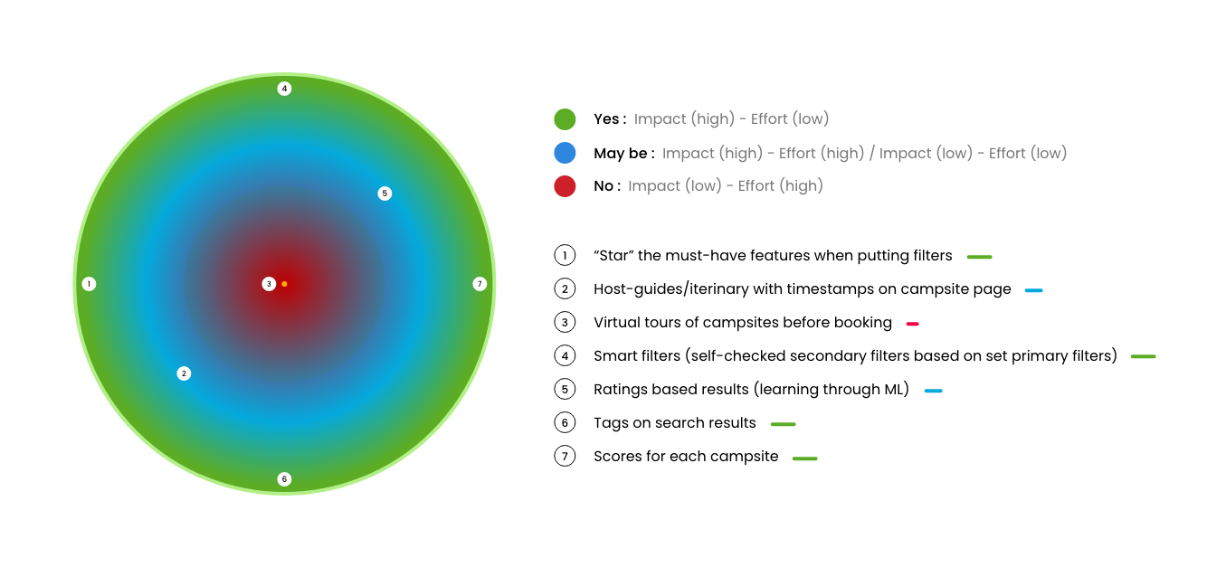
Analyzing impact vs effort
We had a lot of discussions around the branding, feasible ideas, and after many iterations, finalised upon the following designs…
1.
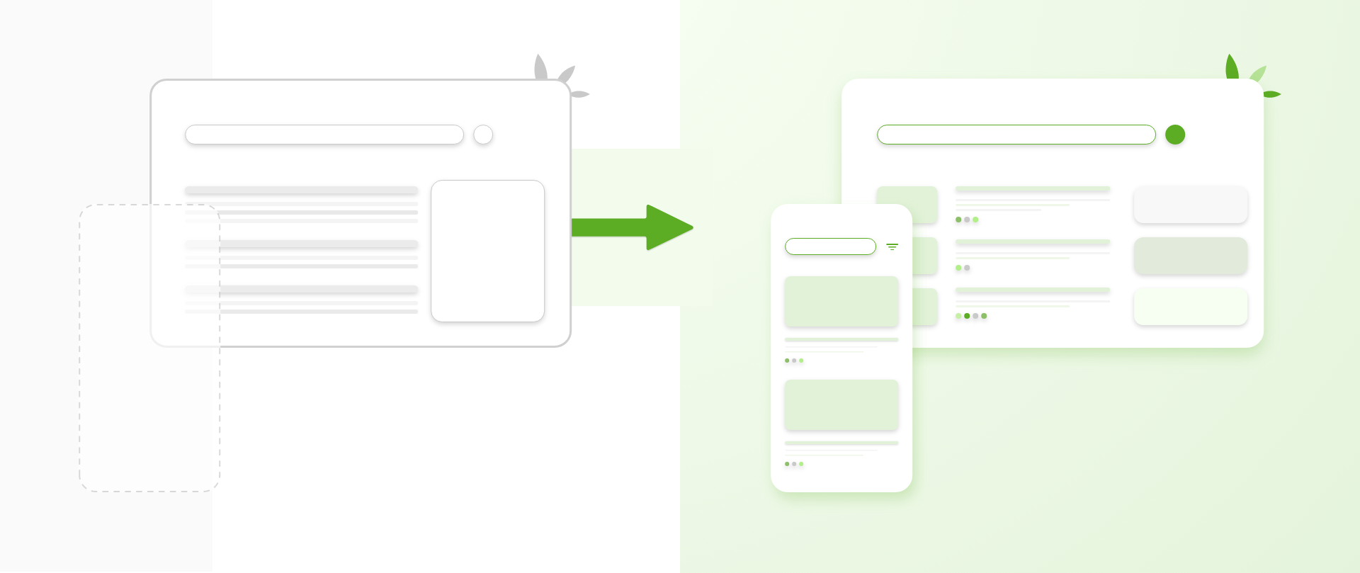
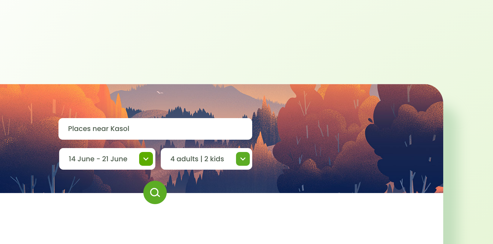
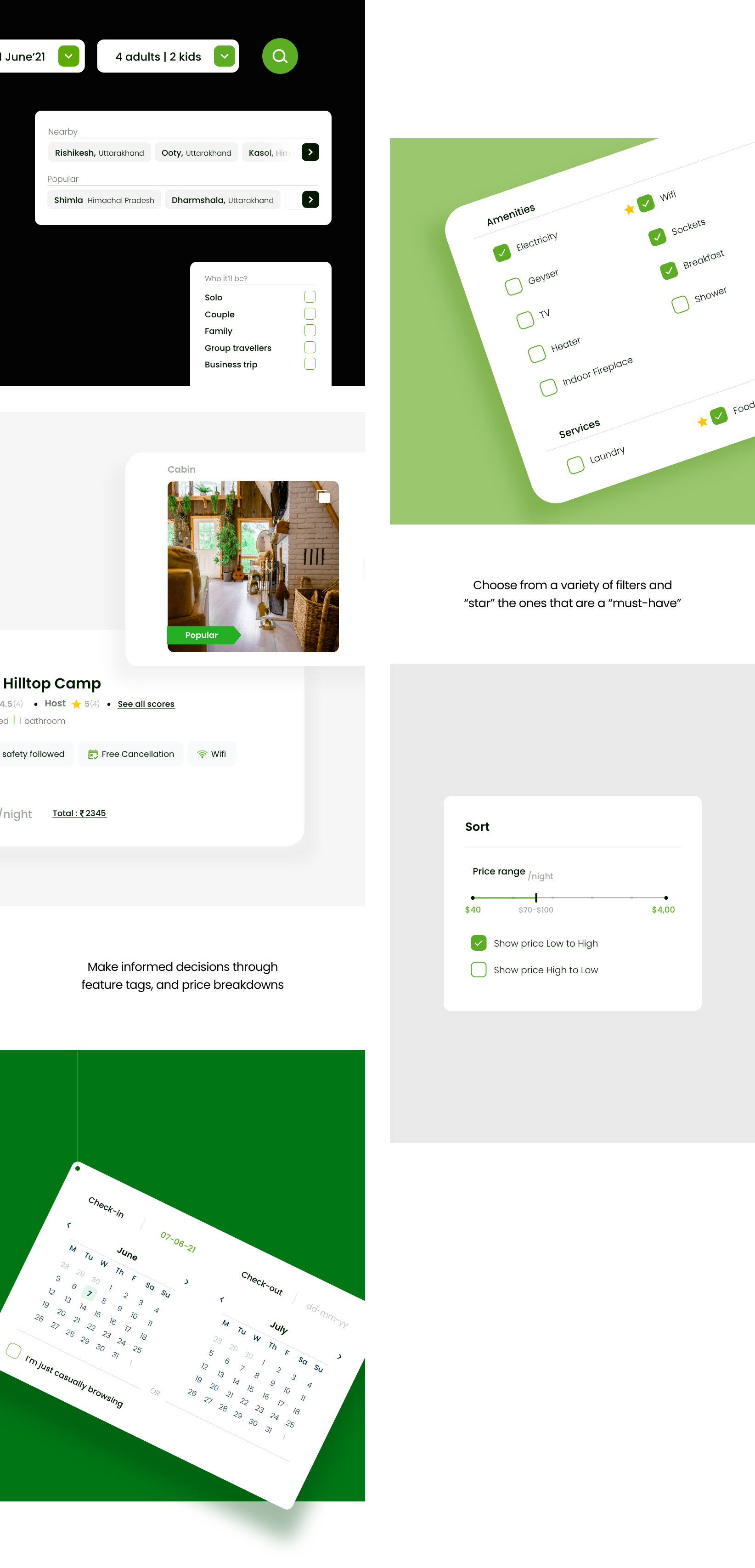
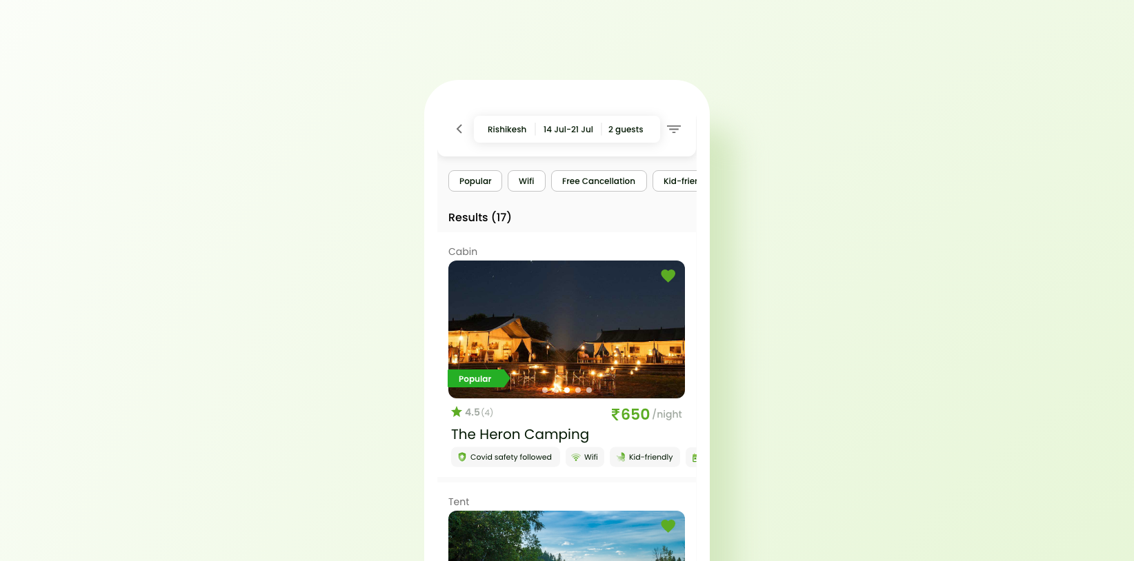
Searching for a campsite
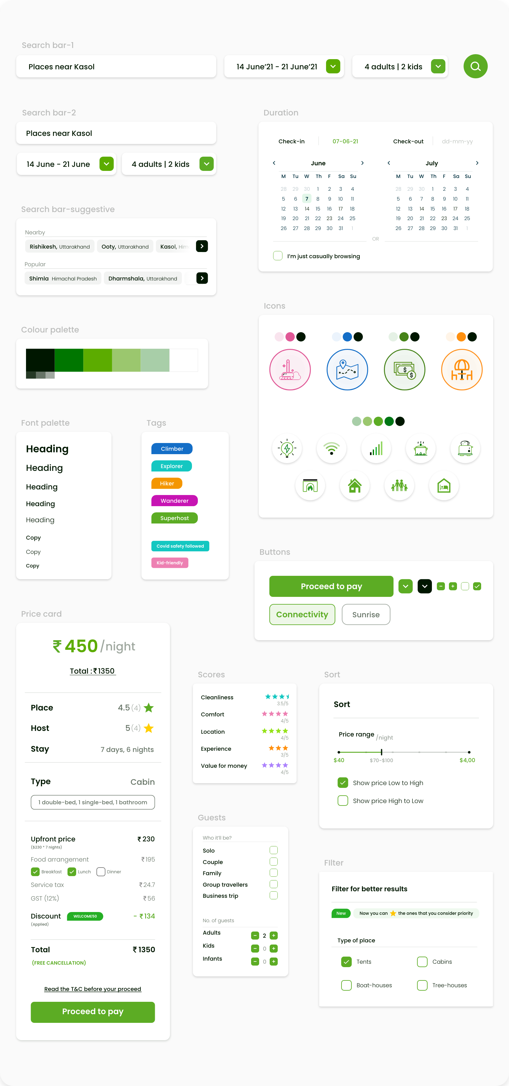
The user should be able to customise their search for accuracy and make informed primary decisions from the search results itself, without having to open and analyse each campsite page to know its features.
Mobile
2.
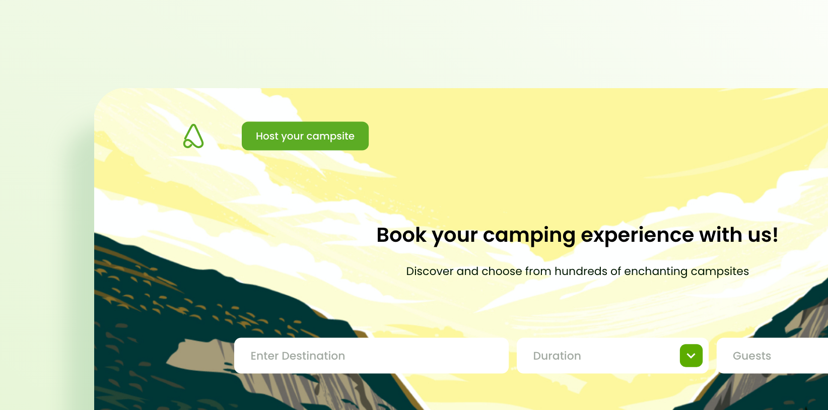
Landing on the right page
The landing page should act as a secondary filter to the search, for users, as well as communicating the myriad of campsites HireACamp has to offer.
Mobile
3.
Picking the best campsite
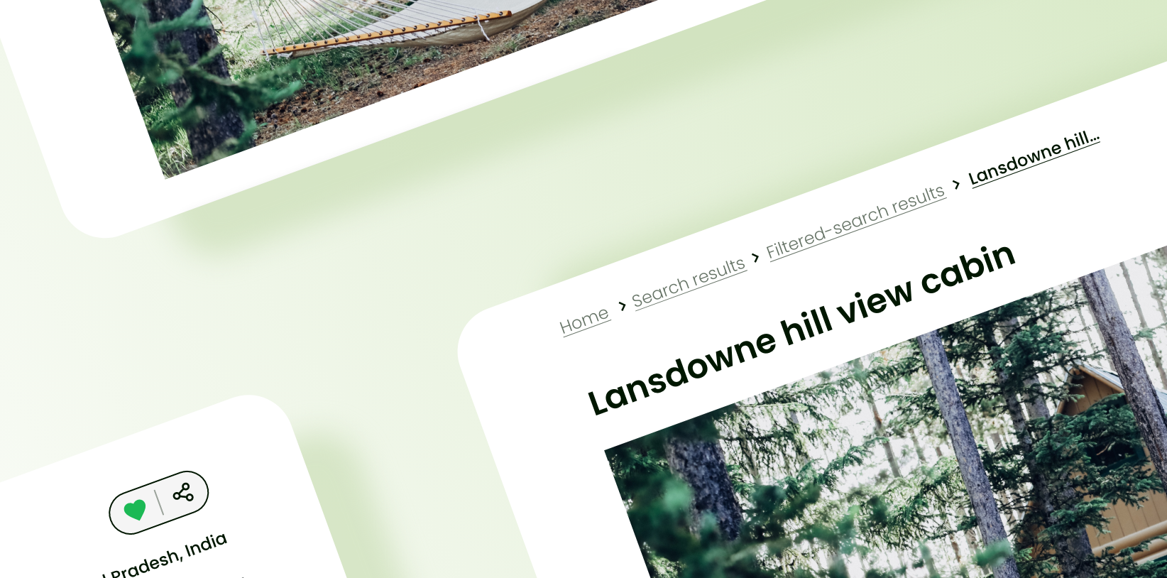
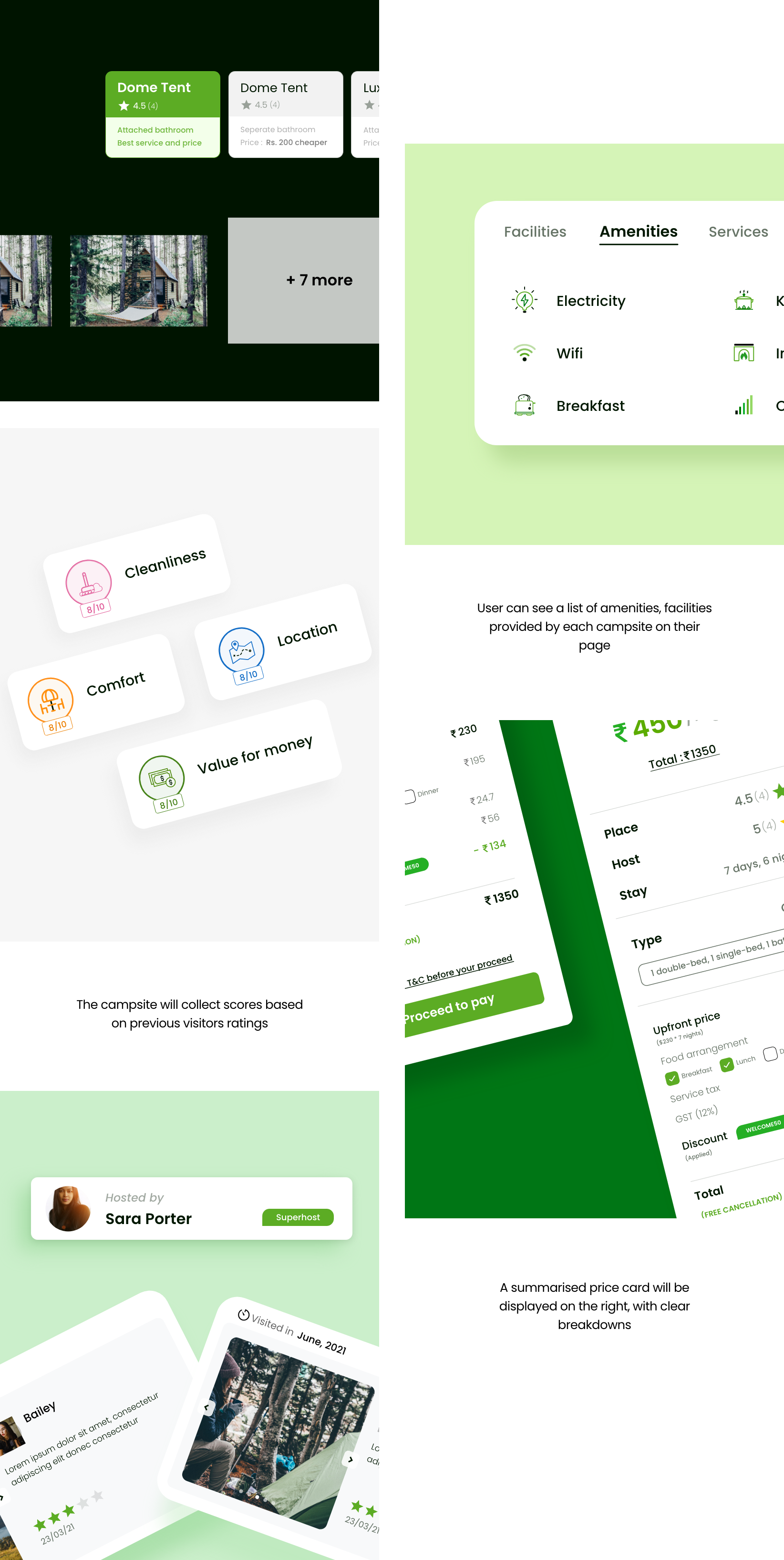
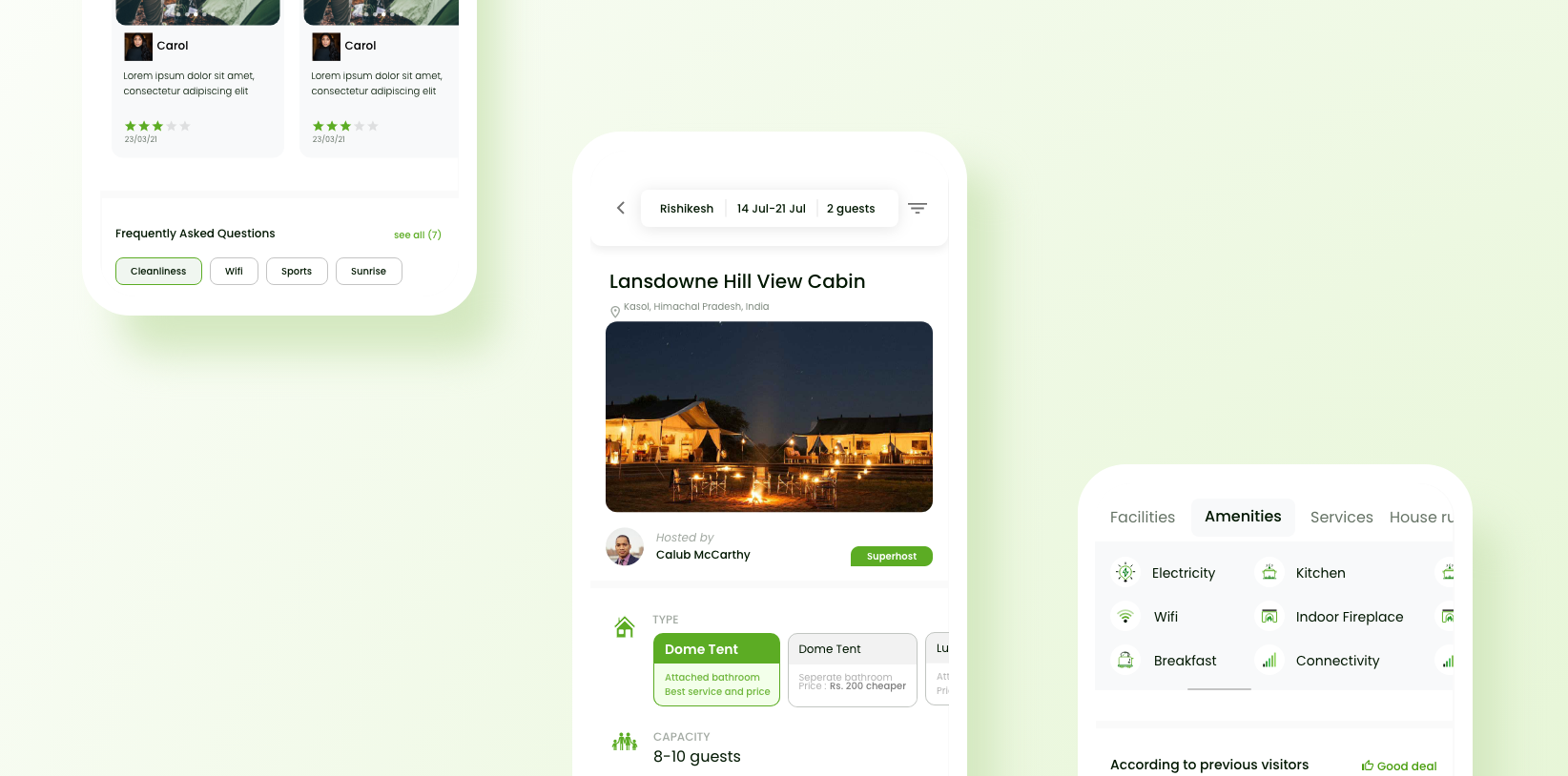
The campsite page should contain every information that the user needs in order to decide whether to proceed with booking or not.
Mobile
Branding
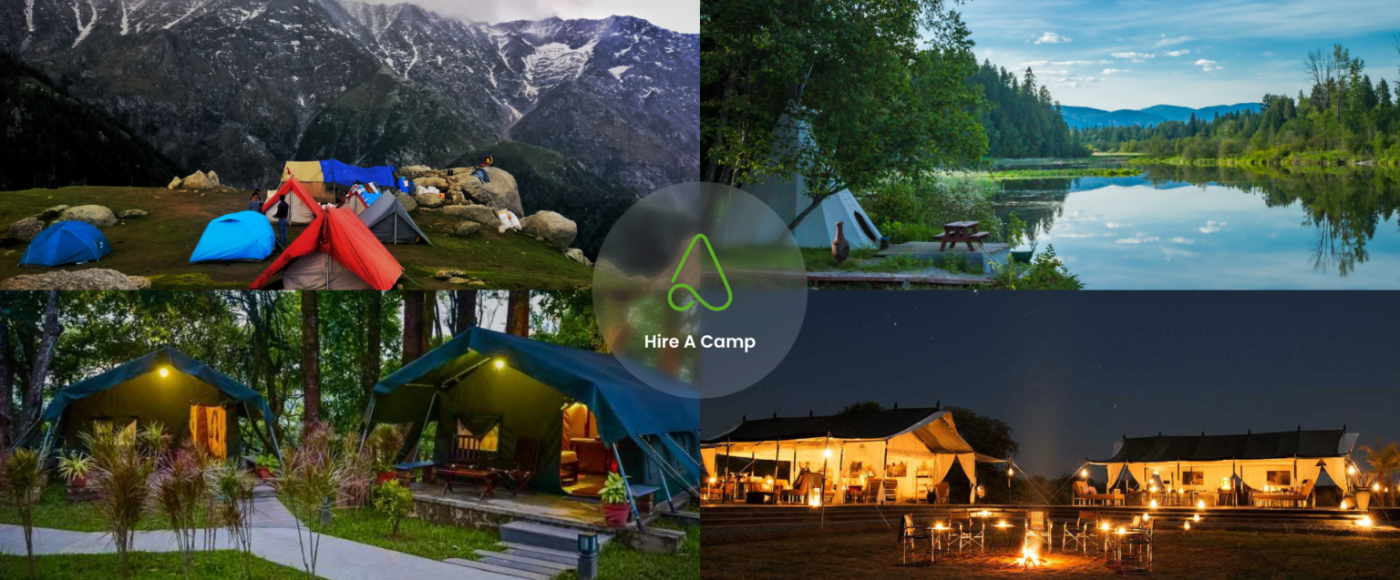
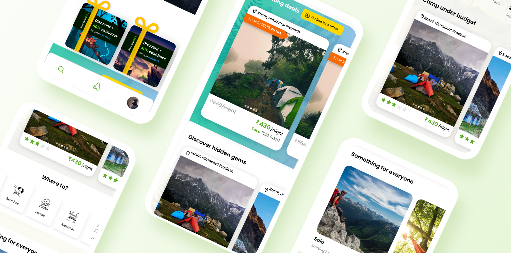
After researching on the product and its roots, I tried aligning the new designs in a way, that reciprocate the joy of camping as well keep the search healthy and intuitive for the user. Below is a glimpse of the same.
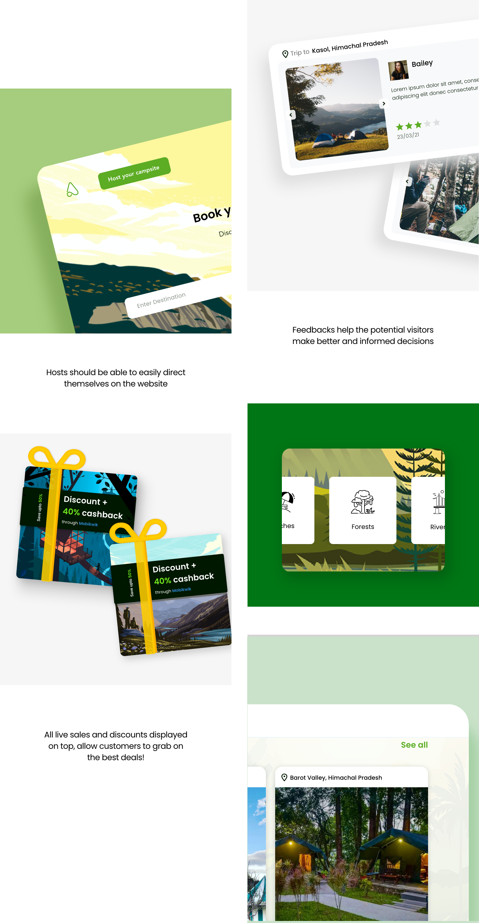
Elements & components
While I was designing the website on the user-end, a fellow designer of mine was working parallel on the host-side app (shoutout to my design buddy!). We kept our paces on the same page, through continuously discussing, brainstorming ideas together and helping each other out of design ruts, so that our approaches ultimately complement each other.
Take away
This internship was a new experience that helped me improve my approaches in research, benchmarking, considering business needs while designing upon user needs, and collaborating with other designers as well. <3