Ruby is a concept design for a “Budget tracking” mobile phone application, specially dedicated to the housewives, facilitating them in keeping their expenses under budget, figuring drain heads, and creating savings for a chosen interval of time.
Background
Project :
Solo project
Duration :
2 weeks
Role :
Product design, Research
Choosing to be a stay at home mother and focus on raising the next generation, is a noble calling. However, giving up a job to be a full-time mom does come with sacrifice. Learning to live on a single income can be a challenge and will require extra planning and budgeting. For all the stay at home moms, there are a number of ways that they can not only be financially secure, but can also earn and save.
Housewives or homemakers, get a limited amount to be spent, as per the household and family requirements.
Design challenge
In order to keep their spendings under budget, housewives, will need to have a reliable platform, to keep track on their expenses, that allows them to collect down some as savings.
Design solution
An app that caters to the needs of the housemakers, in ending up with some savings by the end of each month. Informing them about their daily to monthly expense patterns, and helping them point out drain heads, allowing them to take appropriate actions and saving money.
Target users
Homemakers or housewives, who have to regulate expenses and savings, from a limited amount, on a monthly/yearly basis. They cut-down on unwanted expenses and considers to prioritize the needful.
Going about the process
Research
Why this idea anyways?
It was a family function, and a group of women, who were all housewives, including my mom, were discussing on this issue. How can they maintain expenses and keep spending under their budget? It’s hard to keep track on a daily basis, even if they note down a schedule of smaller expenses, by the end of the month, they somehow lose all the amount in their hands and are unable to track the exact reason (or drain head per say).
This peaked my interest in the topic, and I wanted to know the main reason, why were their issues in spending on daily expenses, and keeping under budget.
Ask them directly? Why not.
Asking the people directly, was the most obvious way to find out the problems, but before that, I did some desk research about the scenario, the why’s and what’s of the issue.
It was only then that I decided on interviewed 4-5 participants from that previously occurred group discussion.
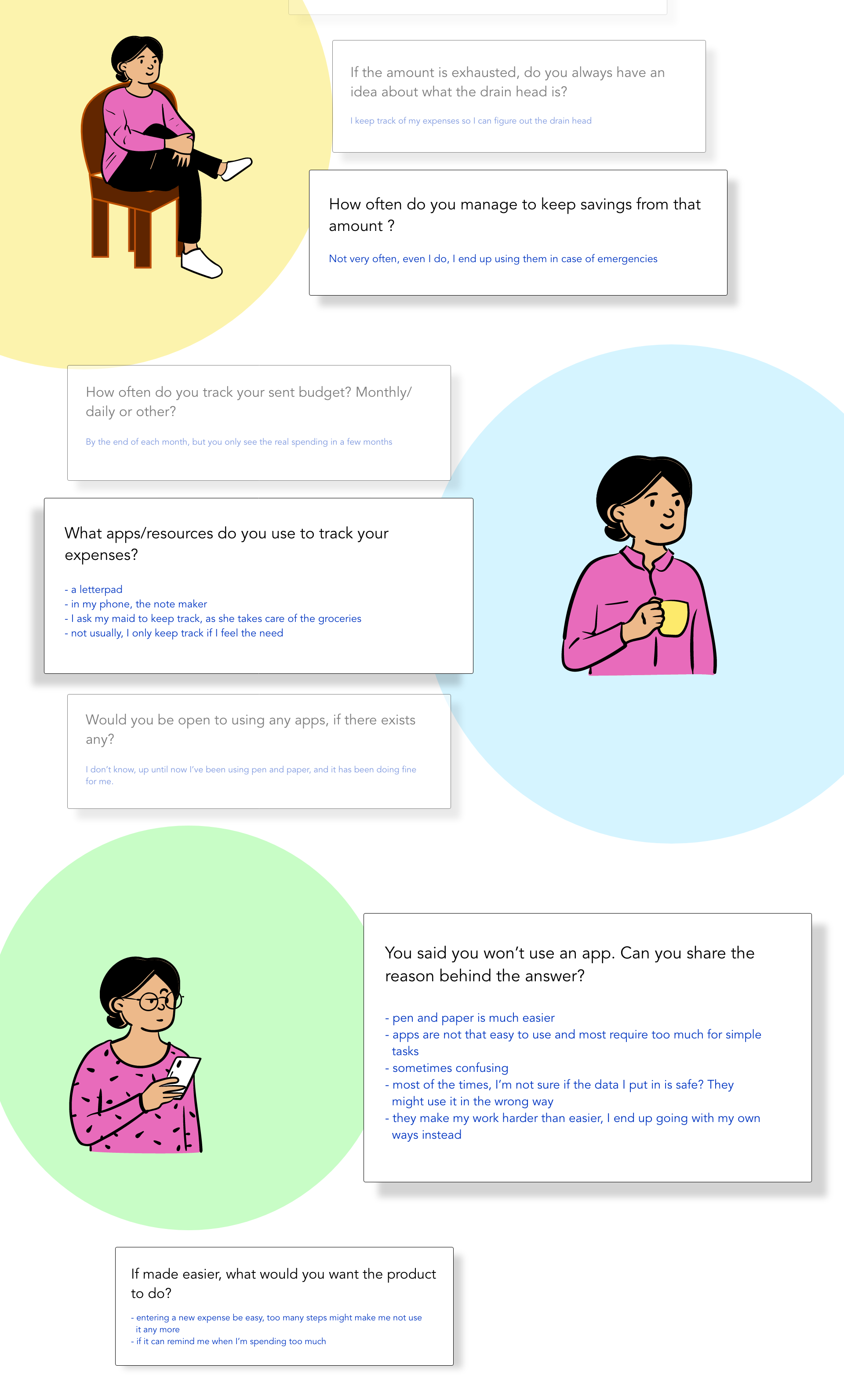
On summarizing the interviews :-
(My questions were designed with an aim to know their pain points, how they tackle situations, helpful solutions, exposure to other apps and resources)
On people’s reluctance to apps and technology
Women once lagged quite far behind men in technology adoption and use, and still do in many countries (International Telecommunications Union [ITU], 2012), although usually by much smaller margins than decades ago. Moreover, Internet penetration rates remain higher for men than women in all regions of the world.”
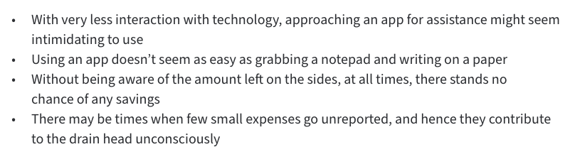
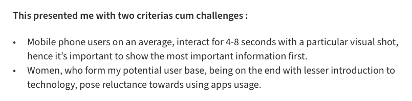
Analyzing the pain points :-
Ideating solutions
Keeping the above points in mind, the most appropriate answer was, to pursue “task oriented approach” or “activity centered design”.
Brainstorming multiple solutions, different design iterations, and rejecting some of the ideas/solutions that were divergent from my ideal approach. I ended up finalizing on a single design concept.
What can be the different ways to cut back on spending or spending under the budget :-
1. pay by cash, not card
2. use gift cards
3. track your expenses
4. organize to stretch your budget (the difference between want and need)
The product’s first set goal is “expense tracking” oriented, and solely focuses on bettering for this particular aspect of the four.
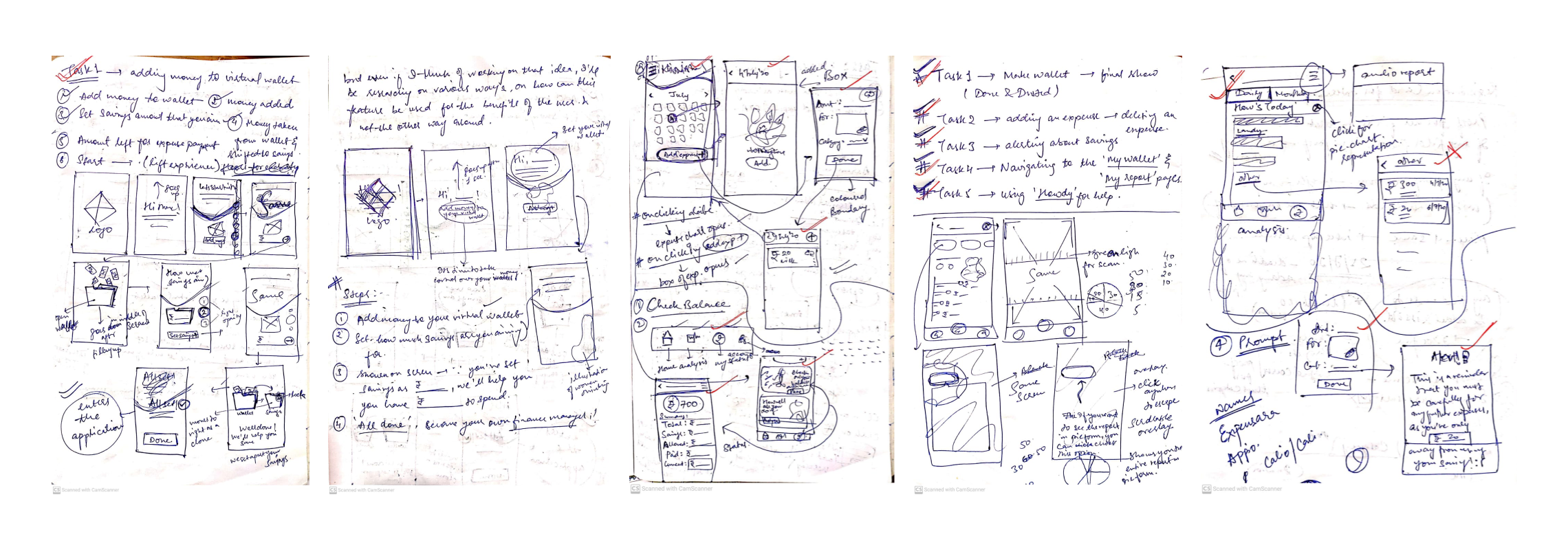
Low-fidelity wireframes
(Designing the features)
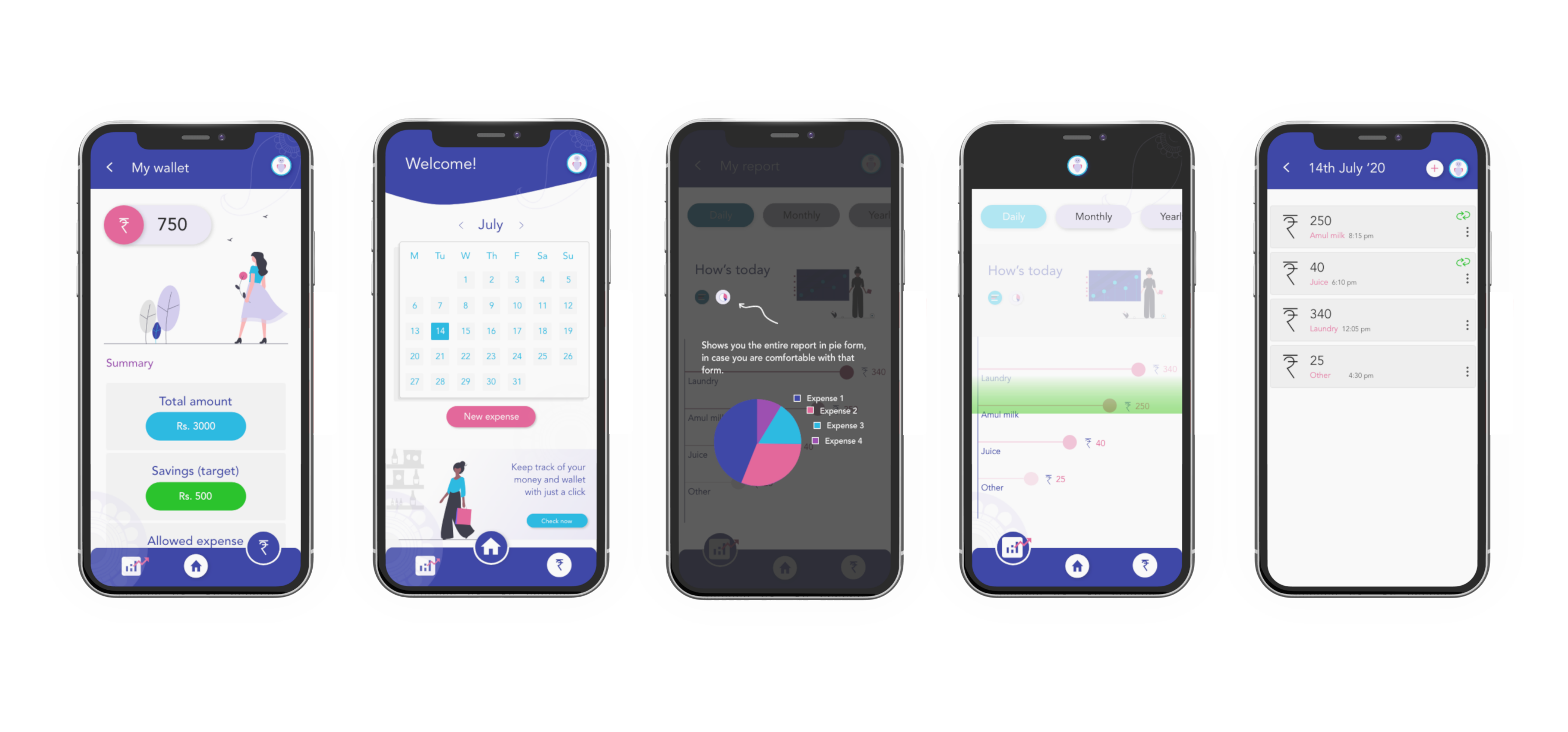
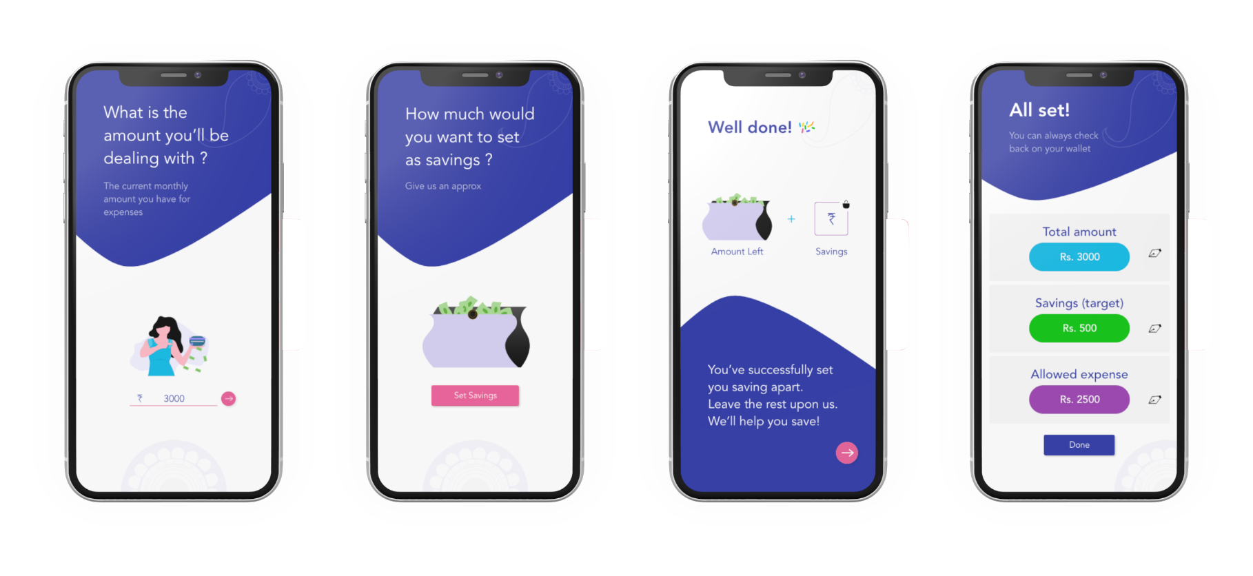
Task 1 : Adding money to your virtual wallet
To gain a sense of reliability for the users, the app asks the users to add the amount they have in their hands in the beginning of the month or in that instant per say, in their virtual wallet, followed by the savings they expect to collect from that amount. These few steps allow the app to work on the given info by the user, in the back-end.
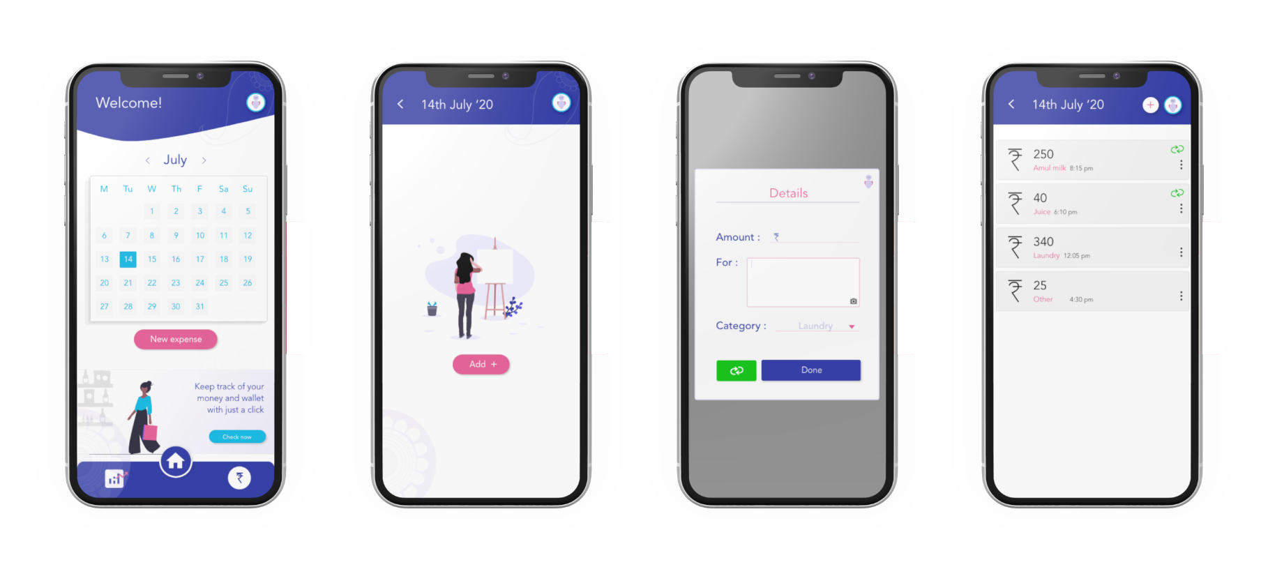
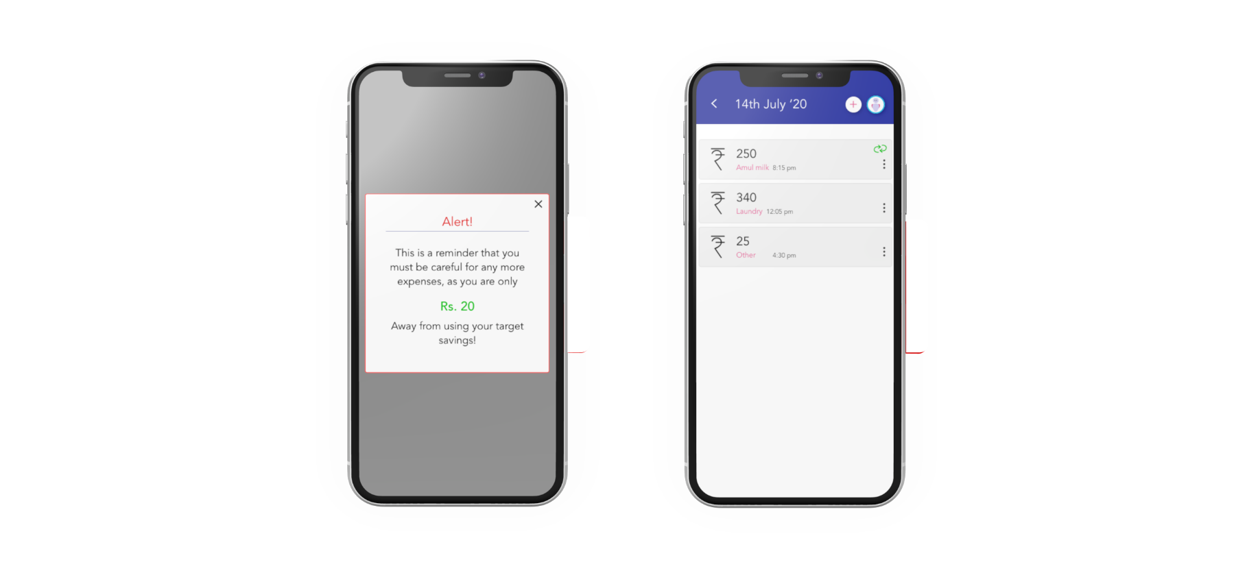
Task 2 : Uploading/adding a new expense
Regardless of the environment of the user, the app must allow them to add an expense there and then, without much efforts. Apart from adding and expense, the calendar UI at the homepage allows the user to browse through their expense charts for different dates in a month.
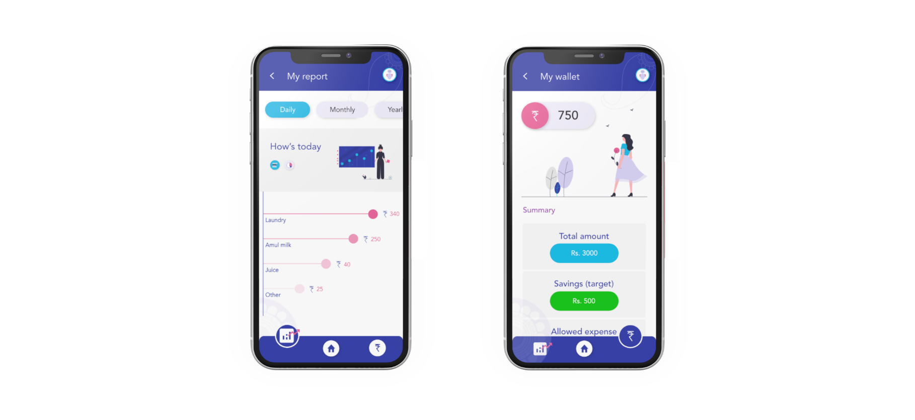
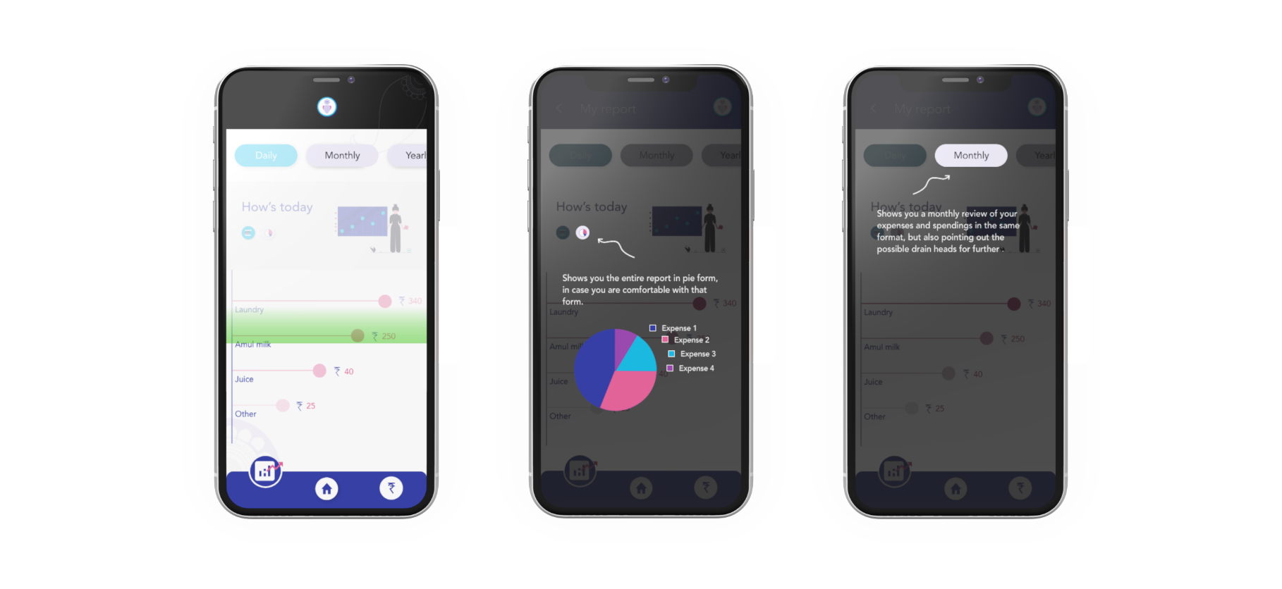
Task 3 : Checking virtual balance, and analyzing expense drains
If the user needs to get an idea about their spending habits and patterns, they can analyze the easily readable reports, represented through bars, and pie-charts, leaving it on the user to choose whichever form of information they wish to choose. App also allows the user to keep a constant check on how much have they spent, how much is left, etc.
Task 4 : Prompt on exhausting savings
In the beginning, the user was asked to give an idea about their expected savings. From thereon, the app keeps track of the expenses, monitoring through different categories that the user chooses while adding each expense, and keeps on subtracting the those expenses form the “allowed expense” amount. Once the user nears the exhaustion of this amount, they are prompted as a reminder that they are about to use up their set savings.
(this helps the user to turn on strict margins to their spending pattern, once they’re prompted, they might lose on the savings)
Task 5 : “Howdy”, an on-the-go assistant
Although the aim of this app is to be as simple, straightforward and intuitive as possible. But there might be times when the user doesn’t understand certain feature on their screen, and that’s where this assistant might help. The users will be able to access this feature from any screen. Just clicking on it, converts the entire screen concerned, into “assistance mode”. Then if the user clicks on anything on the screen, howdy informs them about the same, there and then.
Final interactive prototype
User testing
After completing my first prototype, I’ve initiated some user testing sessions with the same people I had interviewed earlier.
Points I am/will be checking on :
•Usability
• How intuitive is the product for the users?
• No. of clicks
• No. of errors
• Time taken to complete each task
Currently I’m working on the user testing of this prototype. This step is surely proving to be helpful in getting fresh perspectives to these solutions and tasks. I’m also encountering the fact that there exist many approaches and scenarios through testing, that I hadn’t or couldn’t consider otherwise. I plan to jot down the analysis and results, and introduce alterations to this design accordingly.
Takeaways
Designing through empathy :
For psychological therapies, mental health professionals have ever since, been hesitant to experiment with advanced and effective technologies such as AR, the main reason being the unpredictability of the outcomes/results. Their fear of unpredictability is mainly due to the whole AR experience, not being under their control.
Women determined to find their way to technology and the internet, and have tremendous potential to leverage it to enhance their socioeconomic position, Rural women comprise a huge market portion that service providers can no longer avoid, it is a potential that must be tapped into, meaningfully interacting with technology can transform their lives.
A few , with a usable product, are happier customers, that the masses, with a workable one.
Next steps
• Navigating and executing my designs through user test results
• Incorporating stronger visual identity into the UI
• Adding audio guidance, by allowing audio input and navigation
• Turning the platform in the “online payment” direction, keeping in regard, the initial goal of savings.