Revamping the Exly Creator Dashboard to Boost Retention
Timeline
5 months
Team
Product Managers (1)
Product Designer (1)
Developers (2)
QA (1)
My Role
Product Designer
Product Manager
Quick Summary
The Problem
We had a retention problem. Users weren’t logging into our creator tool as often as we’d like. I started by digging into the data to find out why. Our analytics confirmed a hypothesis: while our dashboard was the default landing page, it wasn’t engaging users enough to make them stay. The design was outdated, cluttered, and offered a limited, static view of their business. It was functional, but lacked the appeal and value to turn a one-time login into a daily habit.
I quickly discovered the dashboard was our “golden ticket.” It was the one place all users, from new sign-ups to returning experts, saw every time they opened the tool. If we could get this one page right, we could have a massive impact.
The Story
My process began with a deep dive into our existing data and a series of interviews with our Customer Success team and key users. The interviews were a gold mine. I learned the dashboard was a source of quiet frustration for many—not enough to complain, but just enough to make them leave.
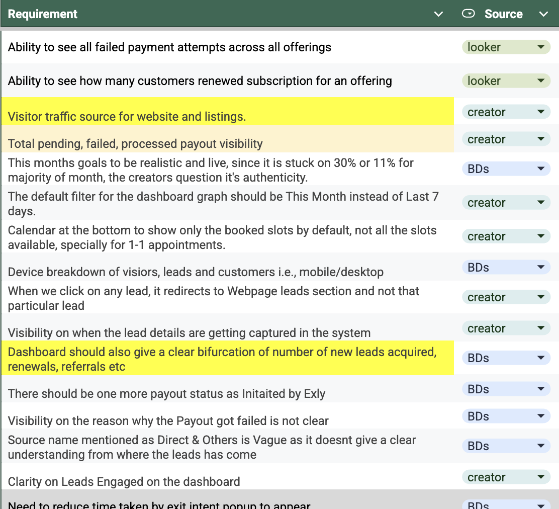
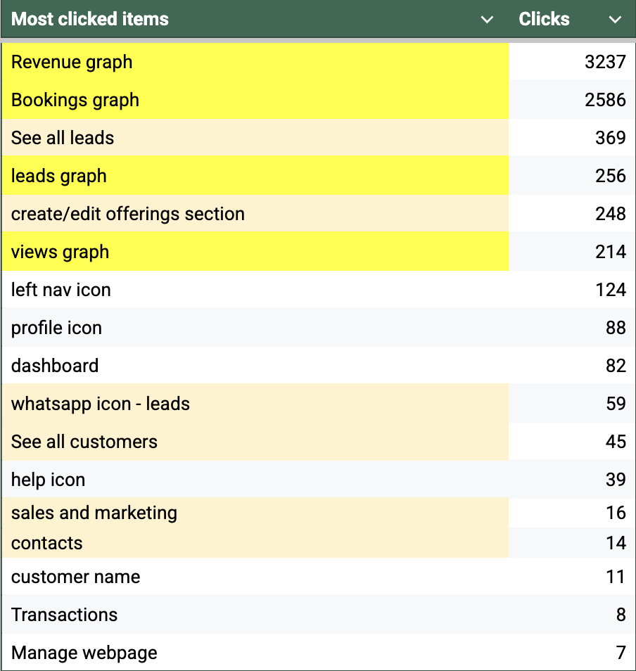
The below couple of screenshots display a myriad of insights we received from quantitative and qualitative data:
Creator interviews and BD surveys data
Clicks and heatmap data from PostHog
The core insights revealed a crucial truth:
A single, one-size-fits-all dashboard doesn’t work for B2B. Every business is at a unique stage
A new user might care most about leads, while an established business needs to track subscriptions and payouts. My design philosophy shifted to focus on valuable data and flexibility. The new dashboard needed to provide meaningful insights while giving creators the power to customize their view based on their evolving business needs.
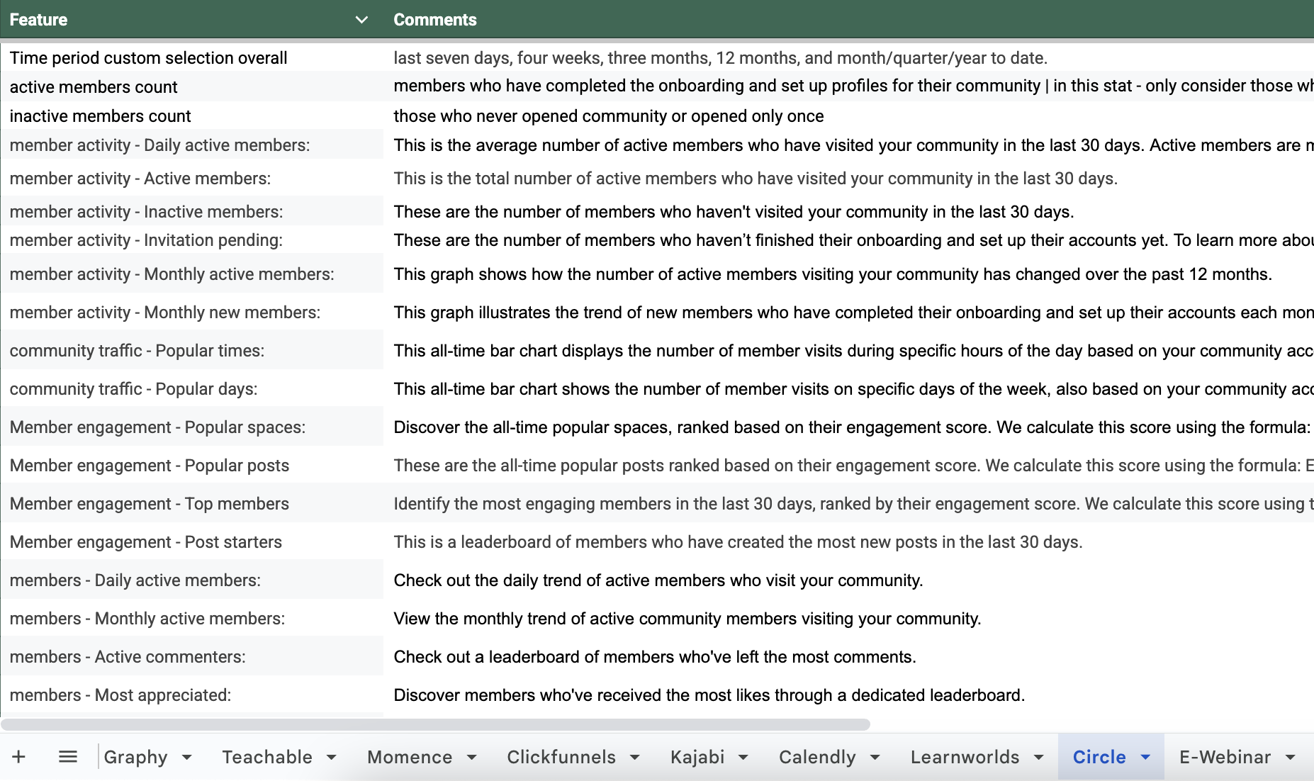
Additionally, we benchmarked our dashboard competitors (dirtect and indirect) for getting an understanding of what data points could be possibly shown to users and how do other products build user habits in terms of educating on data insights.
Competitor benchmarking
My design approach centered on two main pillars:
Once we had all the data ready to fill into the dashboard, we fleshed out our final dashboard widgets, prirotized basis purpose that each widget would serve for the user.
Widget priortization and IA
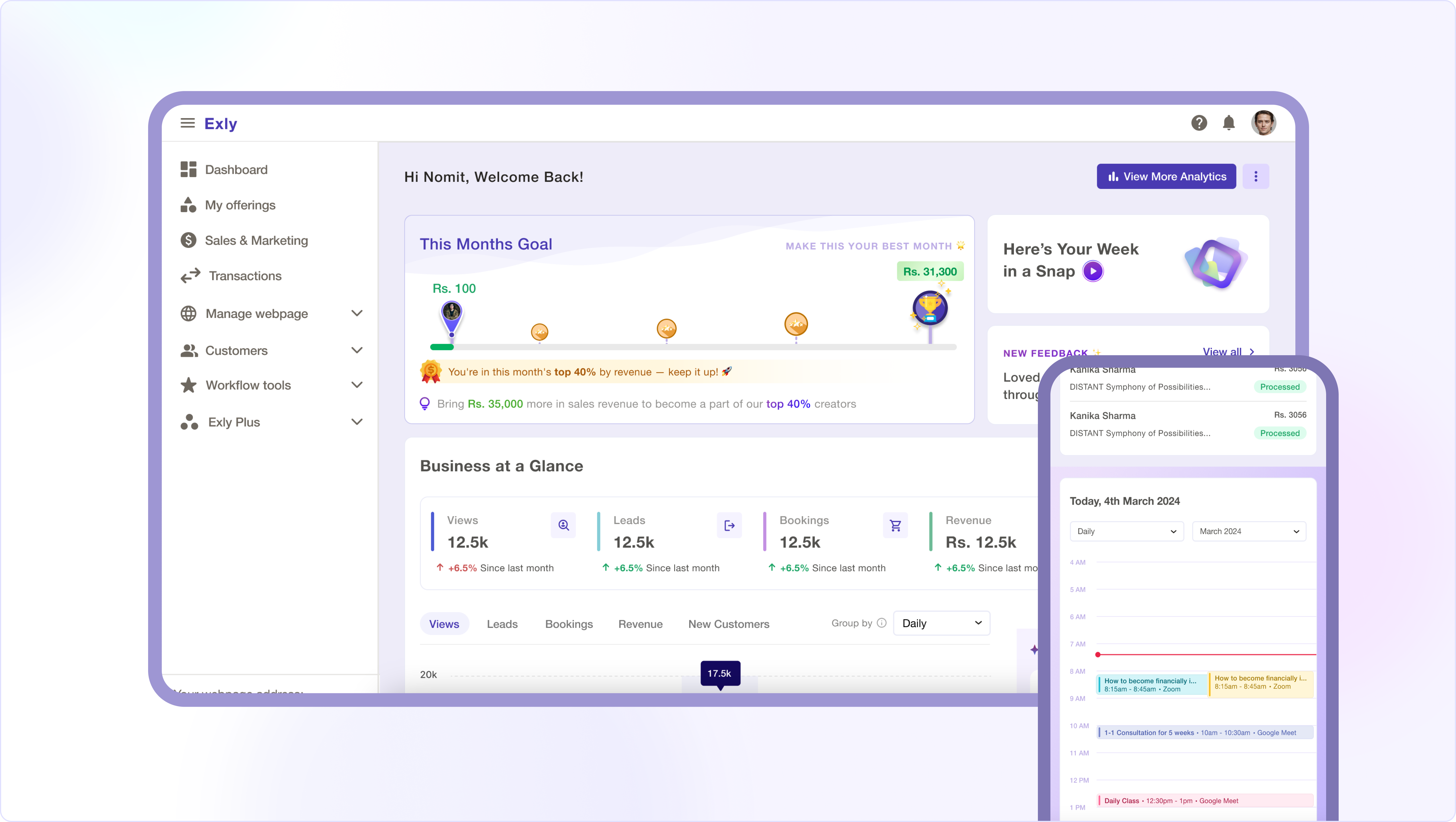
The Solution
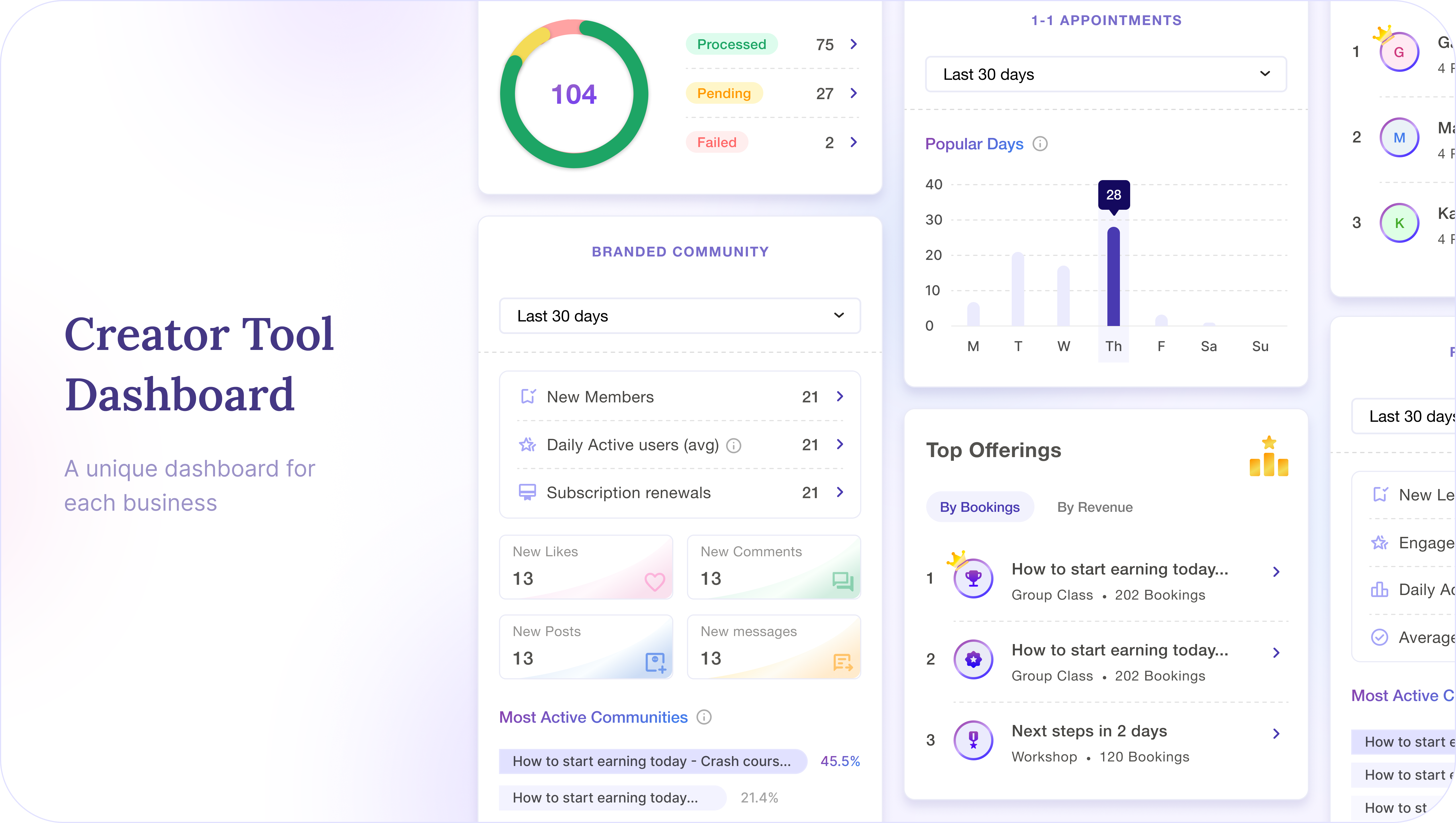
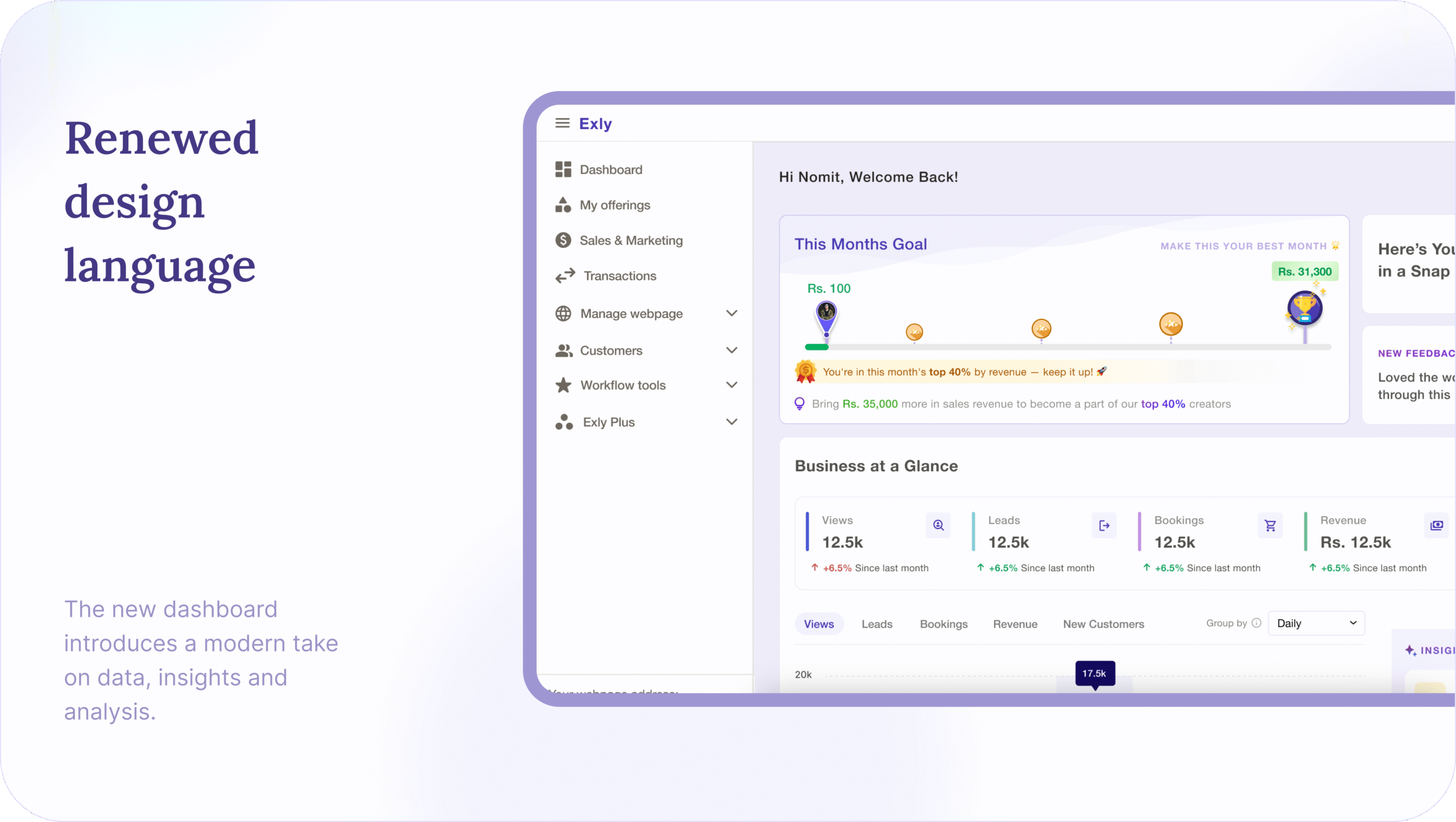
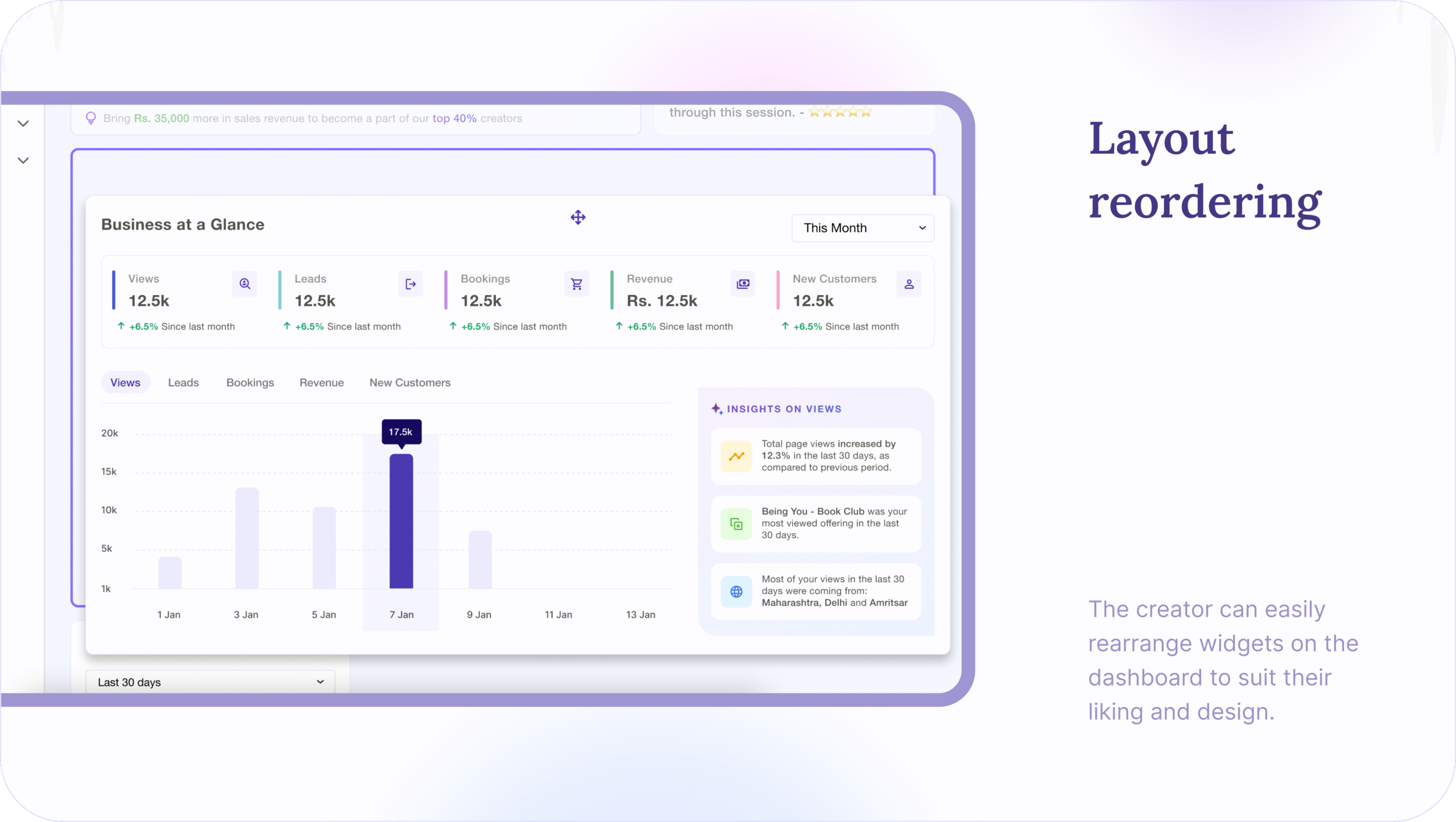
I designed a customizable dashboard built on a flexible grid system with rearrangeable widgets. The solution allows creators to take ownership of their data visualization without overwhelming them.
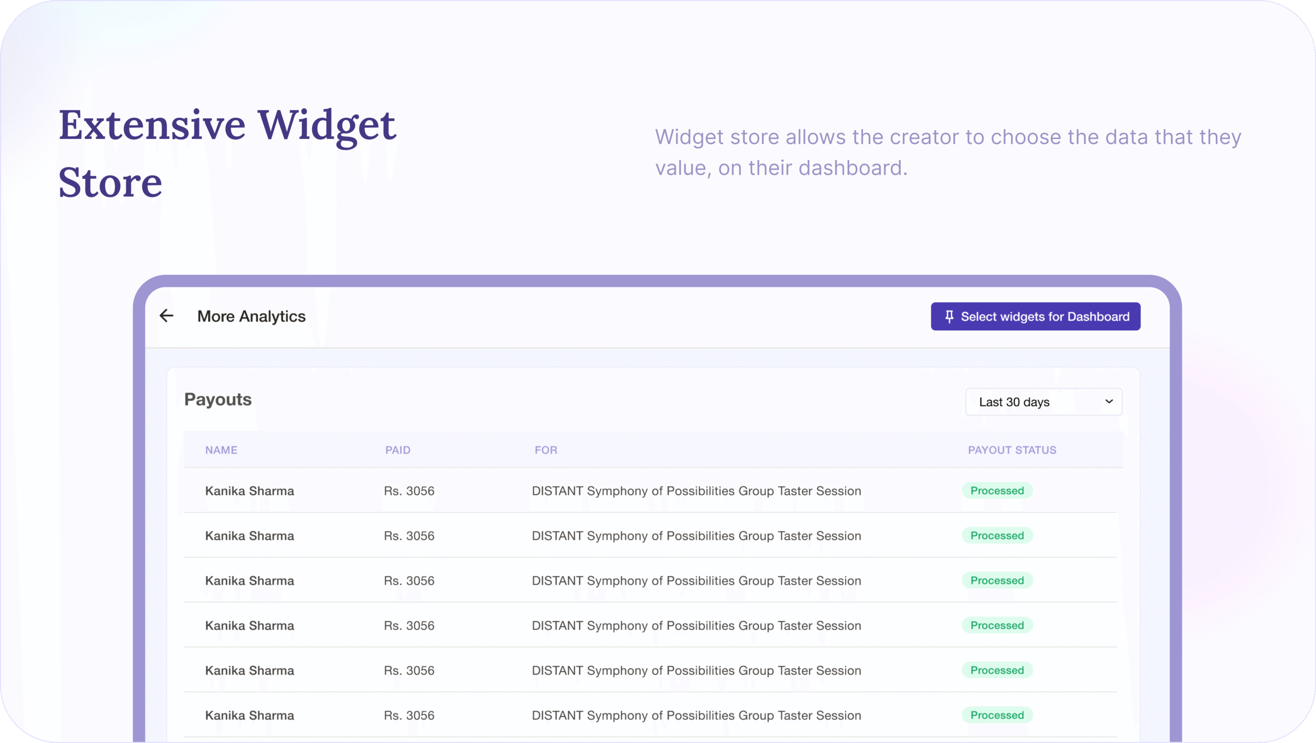
The new dashboard also included a Widget Store—a repository of all available widgets—ensuring that as a creator’s business evolves, they can always add or remove the data views they need. This makes the dashboard a truly future-proof tool.
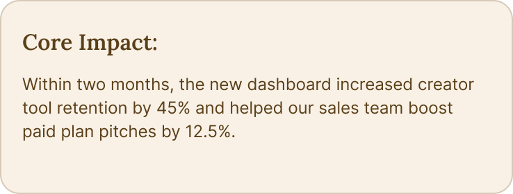
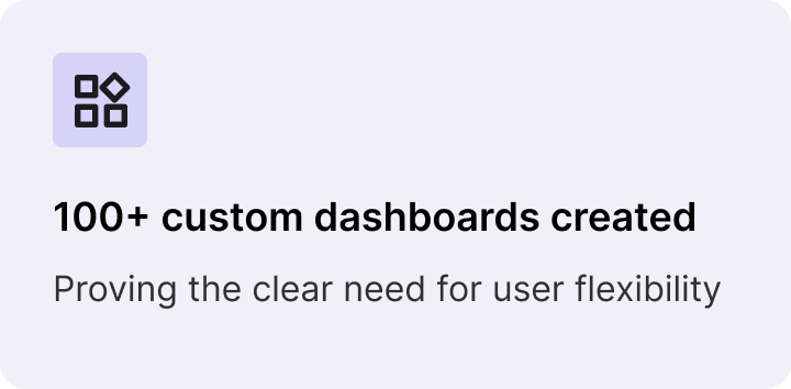
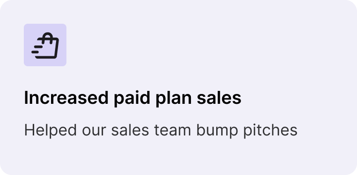
The redesigned dashboard transformed our creator tool from a place users had to visit to a place they wanted to be. The results speak for themselves
The Impact
This project showed that by listening to users and providing them with the flexibility they need, we can turn a simple feature into a core driver of business growth.